Monday, September 6, 2010

My Body of Work: "No Regrets"


My artwork is representational of an emotional journey. In comparison it is not a representation of me- a self portrait, I merely used myself to model the emotion I wanted to express (anyone could have been the subject).
It goes through the very possible stages of a suffering individual.
The first one is very vulnerable looking compared to the rest; the figure is looking looking down and essentially fades into the background of the artwork, the door is in contrast prominent and infront of the figure.
The mood is then suddenly changed in the second artwork, it becomes confronting and slightly unstable with the figure's concerned face, yet within the eyes there is a moment of certainty. Everything is more dramatic with the increased scale.
Then, straight away again the mood shifts to something that resembles instability and an ultimate loss of control, a display of distress. The third one presents this complete change through the change in composition with the strong diagonals, and the larger focus on the figure resembling something quite Baroque styled.
Finally, the last artwork regains the glimpse of control seen in the second one. There is certainty within the face and a sense of stability. The diagonals are gone, and the face is half cast in the light and dark. Here the suffering is being left behind, whether or not it will happen in the future is irrelevant, the individual has overcome an instance of being stuck in a moment and has grown in character because of it, and therefore that suffering will always be a part of them but with "No Regrets" ("Teenage Dream" Katy Perry)

Mission Accomplished!!!

The BOW is finally completed! I've been able to frame three of them and all I need to do now is frame the third one (the last one which I completed).

Here are the first two:


Here are the last two:


The progress to its completed form is evident here in the fourth one.

Done and done. "Artwork no. 3"

On finishing "artwork no. 3" I discussed areas that needed work with my teachers. It came to their attention that I needed to emphasise the structure and shape of my hand, as well as the hair- extending it and making it look more messy.
This was the result after addressing the few concerns.

On to "Artwork no. 3"

Working on "Artwork no. 3" was a similar story to that of "no. 4". My progression of it was again exponential, and it all started when I switched back to the charcoal (the only reason why I was going to use pastels was because I was running out of my current charcoals but Miss bought another packet [which I was extremely grateful for] and I could therefore continue).
I don't have many early stage photos (other than the previous ones shown) for this one because of the fast rate progression, but it basically started from going over the parts in pastel and then moving to the face.


The areas I need to work on now, are the right arm and the toning.

Left side of the face.

I shaded the left side of my face and added some of the highlights.
I need to touch up the lips however, neaten the left side shading and work on the left eye.


Unfortunately I did not capture a single shot of the completed result on its own or the progression of touch up in which I made to finish the artwork. These touch ups consisted on achieving the correct shape of the eyes, lips and then touch ups in toning.

Progression of "Artwork no. 4"

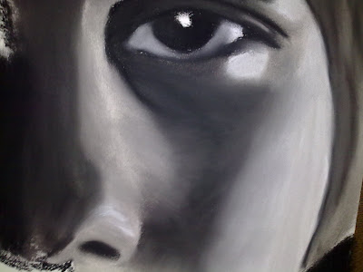
This artwork has kinda taken me by surprise. On working with it I realised that rather than filling in and then adding tone, it was more logical to be adding the tone straight off or paying closer attention to individual areas of colour to achieve an instant tonal effect. This of course was bound to happen considering the cropped view, but even so it has now become evident in my technique that I am paying closer attention to the detail in my drawing as opposed to the photo I'm drawing.
So because of that, my progress suddenly exponentially increased.


Detail of the eye area:


Apart from the left side of the face, I now need to work on my hair and making it look less cleanly cut and more apart of my head. I also need to add highlights.

Starting "artework no. 4"

I made dramatic progress on "artwork no. 4" due to the determination I had in getting it finished for school assessment marking.
Here I've started on the right side of the face, and I must say it's looking very Picasso-esque.

Started on 3rd

I attempted to start my 3rd one using pastels, but the tone it's creating seems to be weaker than my previous artworks.


Close up of arm:


After this setback I decided I'd stick to Miss' advice, and work on it in class after the due date for my BOW (in terms of school assessment). This wouldn't be too much of a concern to my marks as long as I finished the fourth one.

3rd or 4th?

At a bit of a cross road here. I want to try and work on both my artworks at the same time but I've been told perhaps I should focus on one? Miss suggested I do this and focus on the fourth one. It makes sense considering I want to try and be expressive with my fourth one.

Time Constraints

Due to my BOW being due for school assessment marking, I had to speed up the work I did and so I decided to leave "artwork no. 2" and return to it for later touching up.
Now I had to look at a vision of my BOW, that was set in stone, so the question remained... What was going to be my fourth and final artwork? I've previously mentioned the idea I had had for that, but now with the time constraint and the uncertainty surrounding that idea, I needed something else. Upon brainstorming with miss, we found the answer, and it lay within "artwork no.2"- The face. We decided to crop the face and then draw it on the same size page as "artwork no.1" but, obviously it is enlarged because of the cropping.


Now all that was left to do (having drawn up my "artwork no. 3" and "artwork no. 4") was fill and colour it in!

Sunday, September 5, 2010

Almost there for no.2!!! YEWW :)

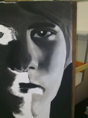
The dark tone of the artwork is starting to really emanate from the charcoal; the scale of the artwork complements this. However, work on the right side of the face is still needed to achieve the correct proportion within the face.

Becoming more expressive...

It is important that the blending in this larger one is not overworked but at the same time smooth so as to really get that shape in my artwork. Below I am beginning to work that style of toning on my chest and face. Still not quite there yet.

Toning and Filling

Here I'm starting to tone up the face adding some depth as well as continuing filling in the white areas.

Progression of Artwork no. 2

Filling in the main areas.

Wednesday, June 2, 2010

Starting the next one xD

Ok so my next piece is well under way and I'm lovin` it!
I really prefer the larger scale in this one, kinda odd considering I was so skeptical after doing my first one, but it's just so much easier to work with and to demonstrate what I can really do! Also I'm starting to get gritty with the charcoal, some advice Miss gave me, cause I completely agree about my other one, there was just that charcoal quality missing in some areas but hopefully I will revisit that and give it a few more touch ups.
Anyway so here's the first installment of my progress for my new piece.


Thursday, May 6, 2010

FINISHED!!!

Ok I lie... I'm not exactly finished... However, the tone is where I want it, and the shapes that have been created by the tone are quite refined. The overall mood of the work has come across awesomely! There the figure is, fading into a dark background with a look of remorse on his face- something's not right, the context of him behind the door should give a sense that he is disconnected to what lays outside the door (he's hiding). The audience looks in on the figure, but his eyes divert from the audience, allowing for a sense of empathy/sympathy.


Getting rid of the nasty white dots!!!

Ok, so basically although the texture of the paper is clearly visible, some of the white dots it leaves are too prominent and now I'm going over them. Also No more white background, and i've been beginning to tone up the shirt..


The picture as whole looks alright.. I need to make it fade into the background more and refine the shirt.

Smudge Paper :)

Below is my very good friend who I've been using to experiment with tones and briefly with other medias such as water paint, charcoal powder and water itself (which miss helped me with).
I've also made good use of him when I needed clean fingers for a different tone xD


Tuesday, April 13, 2010

Shall I leave the face?


I think I may have finished the face... Not sure, but I'll check with miss to see what she thinks.


If I've finished the figure I'll move onto the background and make it all black. Still tossing up whether I should put tone in the shirt too...

Refining... Again -_-


Further refining lolz... It's actually pretty good now! Just that right eye I may need to work on. I've been mainly focusing on that area and it is extremely difficult. Perhaps a little more work on it and I'll finish the drawing off entirely, and next move into some interesting effects!!! xD


Note: I accidentally cast a shadow over my work in taking the picture.
As whole looking good xD

Monday, April 12, 2010

Trying to Refine...


Smoothing it out now, still trying to add the smaller details.


Whole picture, yeah when I took it, it was kinda not straight lol.

Saturday, April 10, 2010

Progress has declined...

Argh!!! It's killing me now... I'm so close yet sooo far away! The intricacies of the face are very difficult... Plus it doesn't help using an overhead sheet to look at the tone. I had a look at the original picture too but it's in colour and very dark so I can hardly see the tone, and to add to all that the size is blown up so it's deceiving when I try to copy it.
A note on the equipment- The smudging tool has been so difficult to use. Every time I use it, it removes the charcoal rather than smudging. So annoying...


In the close up of the face, you can see that the left side is much more refined due to the absence of highlights. Getting the shadows and highlights right in the right side of the face has proven difficult. Points for noticeable expression on the face xD


An overview of my work shows that I'm beginning to darken up around the figure and filling out the door. I love my door... How about I cut the rest and keep the door? : p

Friday, April 9, 2010

Art Fun xD


STAY AWAY!!! I'm Dirty... :(


Grrrr!!! Art Attack!!! Hehehe xD


I seeeeeeeeee yooooooooouuuuuuuuuu....


I was focusing on the door here, and in particular the knob. Also Started to darken up around the door and arm just to see how the figure and the door contrasts to the background.


Focusing on the door knob and beginning to tone it up therefore its beginning to show depth.

Wednesday, April 7, 2010

Developing 1st Piece from BOW


Coming along, I'm liking the progress. You can see the area where I am having difficulty; the eye on the right, and the lips but I will continue working on them till I get what I want.


Hehehe looks like I'm pouting!!!

Tuesday, April 6, 2010

Ideas

Ok I had a vision of how my BOW is gonna look like.

My first piece the one I'm currently working on will just be a plain charcoal drawing; I'll work on the effect of manipulating the charcoal in different ways while also exploring with water colours. The focus will be on the figure looking down, and the how the figure essentially fades out into the darkness.


The following pieces are still in the developing idea stage:
The second piece will be another charcoal drawing of the figure. If I decide to not go with the same composition as the first drawing I will crop the picture I want to use so there is a large focus on the face. I was thinking of colouring the eyes, so they'd be blue. It'd be a prominent contrasting feature to the rest of the work and it would making it more confrontin as the figure looks out.


The third piece would be the most dynamic piece. The composition would be likewise to my first piece of work apart from the actual figure which will be in a different pose. I'd then like to reflect the powerful pose structurally through the use of perhaps many colours or even just harsh strokes or rough drawing. This one would be my biggest challenge and I would at the least like to complete my BOW up to there.


If I can I want to produce a fourth installment, where the mood becomes less dynamic and resembles more of the first two. I would need Ms Higgins' help for the picture. Basically I'd like her to be holding onto the door knob and it should look like she just closed the door. The focus would be on the hand and that's all you'd see on the figure. However what would be recognised hopefully is that it's an older person (Not saying that your hand looks old miss!!! But similar to that of an adult woman). The colour would not be as apparent in this piece and it should leave a feeling of detachment .

Sunday, April 4, 2010

First practical Post

Ok so this is the first look at my first piece of BOW. It's in progress, but I'm enjoying the whole "creating" phase.


With this one the tone is finally becoming more apparent, cept I'm not too sure bout the proportion of the chin. I feel as if either the lips should be lower or the space between the lips and nose should be larger.


Just a note: Background will end up being black


Close up of face with a bit of tone.


Starting to tone up :)


Outline of face


Outlining in pencil